A digital native driven by the ability to obtain influence in a time that is characterised by change and technological development. I constantly strive to become wiser and gain experience within the field of digital design and communication; this includes designing digital and innovative communication solutions that can keep up with the development and take users’ needs into consideration.
This online portfolio contains an overview and presentation of different student and design projects I have been part of. Click on the different project names below to read more about each of them.
CopenHarbor
A UX design project by L. Hesselholdt, M. Marckmann, R. Hagemann & P-E. Wirenfeldt
Course: User Experience
Task: Develop a screen-based design that enhances the urban transportation experience.
Copenhagen offers many different options for public transportation. Actually, the public transport infrastructure of Copenhagen is among the most efficient in the world. However, the potential of the harbor busses is not recognised by many tourists and/or Danes visiting the city, even though they provide a different travel experience and can be seen as a form of sightseeing on water.
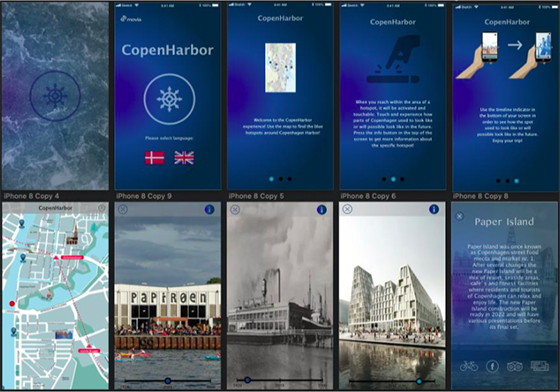
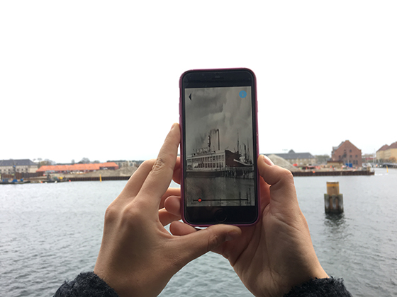
CopenHarbor - CPH past and future is an app based on Augmented Reality (AR) technology that informs, entertains and enriches the users’ experience of the harbor bus by showing the development of Copenhagen Harbour - from past to future. The camera on the users' phones and a single timeline make it possible to shift between different eras and experience how the monuments/buildings/tourist attractions nearby looked like in the early days and will possibly look like in the future. Thereby it should support the sightseeing-feeling, make people aware of the potential of the harbor busses and give passengers a unique opportunity to experience the city from the seaside in a cheap way (compared to other sightseeing tours).
For a visual presentation of the screen-based user experience design and its functionalities, watch the video below. Also, scroll down for pictures of the final prototype.
A Service Design project by L. Hesselholdt, N. Jeppesen, N. Kragh, C. Brixen & F. Jagd
Course: Service Design
Research question: How can we design a service that assists in keeping midwives at the Department of Osbtetrics (Rigshospitalet) updated on internal information in an ever- changing environment?
In large organizations, as in public sector hospitals with institutionalized working practices, an efficient information flow as well as an updated and informed personnel are important to ensure patient safety, treatment quality and employee satisfaction. The hierarchical structure of hospitals and the numerous areas of specializations may lead to organizational challenges. Such challenges become even more complex due to the working conditions at hospitals. Limited access to and use of technical information devices, as well as the limited time to seek information during a workday, make communication challenges difficult to address. Furthermore, a constantly changing environment demands an efficient updating service to ensure an effective workplace with happy and confident employees.
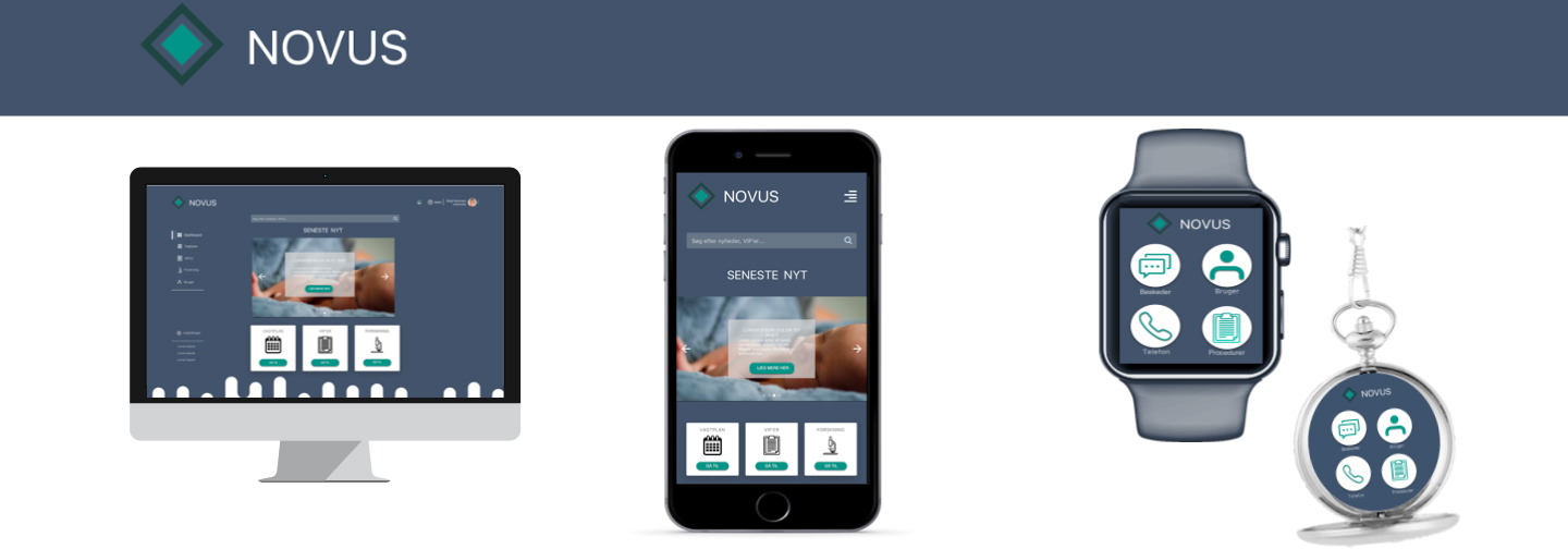
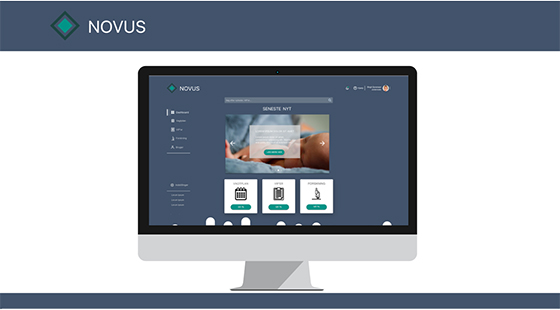
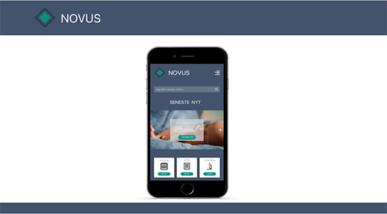
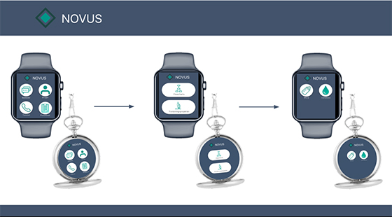
To solve the core problem of keeping midwives updated in an ever-changing environment, we present the design concept, NOVUS. The ambition of NOVUS is, on a higher level, to ensure patient safety, treatment quality, employee satisfaction, and employee confidence by providing the right information at the right time and place. The concept is supported by a platform/an application which is accessible from several devices - smart pocket watches, computers, and smartphones - to accommodate the different needs of midwives. If a midwife is treating patients, she can quickly and easily access the information she needs through NOVUS on a smart pocket watch without leaving patients. However, if she is in the common room at the ward or at home, she can access NOVUS on her smartphone or computer.
NOVUS bridges some of the existing channels at the maternity ward (and connects with the existing physical) whereby it makes information easier accessible and less confusing (everything is gathered in one place and the midwives can find specific information by using the search function). Furthermore, it reduces some problematic touch points identified during research because it is both proactive and reactive: Midwives can catch up on information and keep themselves updated whenever they have the time by using their smartphone at home or the desktop at work (proactive). In situations where the midwives need information here and now - when they are treating patients and cannot sit in front of the computer - they can use the smart pocket watch, since it provides exact guides etc. (reactive).
Mockups of NOVUS - and how the application appears on different devices - can be seen below.
Methods, approaches and techniques used: Design Thinking, Qualitative Research Methods (Observations & Interviews), Service Design methods (stakeholder mapping, ecosystem mapping, personas, scenarios, User Journey mapping, Service Blueprinting), Co-design, Cultural probes, Brainstorming, Sketching, Wireframing, Service Prototyping.
Block off
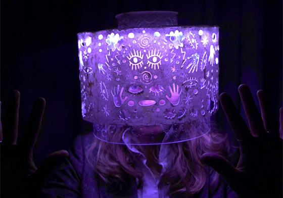
An interactive wearable light design by L. Hesselholdt, T. Nielsen, A. Hoxfeldt & S. Trier
Course: Designing Interactive Artifacts
Task: Design an interactive light that is close to the body grounded in theoretical concepts and material exploration.
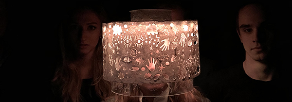
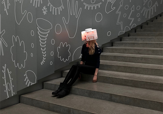
What happens inside your mind when you are not feeling comfortable in a specific situation and when you feel the need to block off the world around you?
The symbolic and critical light design - BLOCK OFF - aims to express and shine light on the uncontrollable feeling of chaos that can suddenly arise inside your mind and be hard to explain in words. Since we wanted to show a transition – from feeling comfortable to uncomfortable, we agreed on 4 different light states that should show depending on how much you rotate the hat – the more you are blocking your face (and blocking off the world), the more chaotic light. Thereby the hat allows a person to open up for the world or keep it out and show the feeling of being into the situation or not.
Inspired by social phobia/social anxiety we wanted BLOCK OFF to make people reflect and understand what might be going on inside a person suffering from it. Watch the concept video below to get a visual presentation.
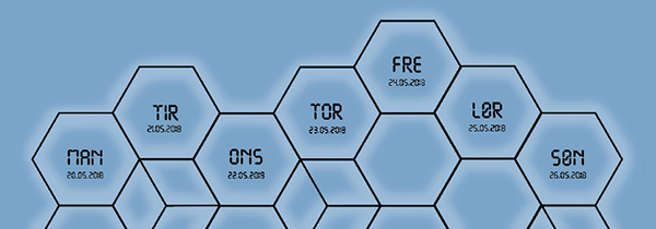
A digital and innovative design concept by L. Hesselholdt, R. Skovdal, J. Freudendahl, K. Holst & M. Marckmann
Course: Digital Innovation
Task: Design, conceptualise, and convey an innovative digital product or service in collaboration with a case partner.
Dementia is now considered a public disease. This has resulted in an increased interest for this market from different companies; among others the digital design bureau YOKE which is a part of the DemensX project.
With YOKE as case partner, it was our job to explore and identify possible innovation opportunities for the company in the existing dementia care practices. This resulted in a reconsidered business model and the innovative design concept Calm Calendar.
Calm Calendar is a concept and an interactive installation that aims to support young and active people suffering from dementia by giving them a visually stimulating overview of their every day life in their own homes. This in order to prevent overbooking calendars which we identified as an issue during interview sessions with the target group. By connecting the design solution to already existing digital calendars as Google Calendar, it allows relatives to set up/suggest arrangements that become visible on the demented’s wall. Each arrangement is represented by a luminous and touchable hexagon which makes it possbile for the demented to reject or accept the arrangement by physically interacting with the hexagon. Our focus has thus been to make the intangible tangible because our physical bodies play a central role in shaping human experience and understanding.
For a more detailed description of the design and its functionalities, watch the concept video below (Note: The video is in Danish).
Methods, approaches and techniques used: Design Thinking, Human-centered Design, User research (interviews), Desk research, Lean Startup, Business Model Canvas (BMC), Value Proposition Canvas (VPC), Mindmapping, Sketching, Storytelling.
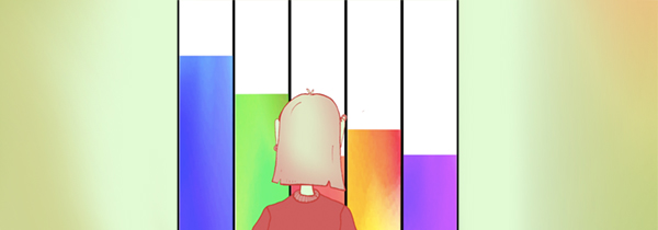
What is Time?
An interaction design project by L. Hesselholdt, C. Frederiksen, P-E. Wirenfeldt, R. Hagemann & M. Marckmann
Course: Interaction Design
Task: Develop a proposal for an interactive technology based on a situation in an existing practice where ‘dependence’ manifests itself in one form or another.
Develop functionality, form and interaction so that it is appropriate to situation of use.
Time is a factor that constantly surrounds and affects us. We live in a world where we are continuously urged to effectiveness and achieving more and more in the time we have. But what is time?
Time is constructed, and our constant dependence on being entertained makes us search for various ways to keep ourselves busy. You could almost draw the conclusion that we are addicted to keeping up with time. This made us wonder whether it is possible to challenge this addiction through an interactive design, where people are forced to see time in a new perspective. By exploring boredom as a theme under the overall topic “dependence” we discovered that most people feel bored while waiting during public transportation. Though, we found that the real problem does not lie in boredom itself, but in the feeling of stress that follows the waiting time.
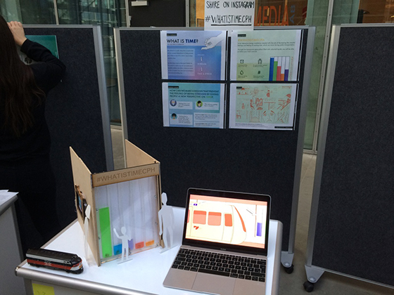
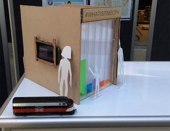
#WhatistimeCPH is an interaction installation designed for Nørreport station that aims to give another perspective on time and make waiting time during public transportation a less stressful experience. This by visualising time in a more pleasant and aesthetic appealing way than normal countdown clocks do. Pillars with coloured water represent the colours of the different train lines. The coloured water will rise from the bottom to the top of the pillar when the belonging train moves closer to the station. The design invites people to share their own perspective on time on Instagram whereby it should lead to reflection and inspire people since the content posted on Instagram will be shown at the station.
For a visual presentation of the design and its functionalities, watch the concept video below. Also, scroll down for pictures of the final prototype.
A website redesign by L. Hesselholdt, K. Faber, F. Jagd & L. Kobbeltvedt
Course: Design for Digital Communication Platforms
Task: Develop an interactive prototype of a website wihtin the theme "Digital Commerce". The prototype has to be made using the coding and scripting languages HTML5, CSS3 and JavaScript/jQuery (No CMS or server side scripting).
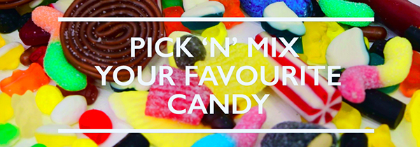
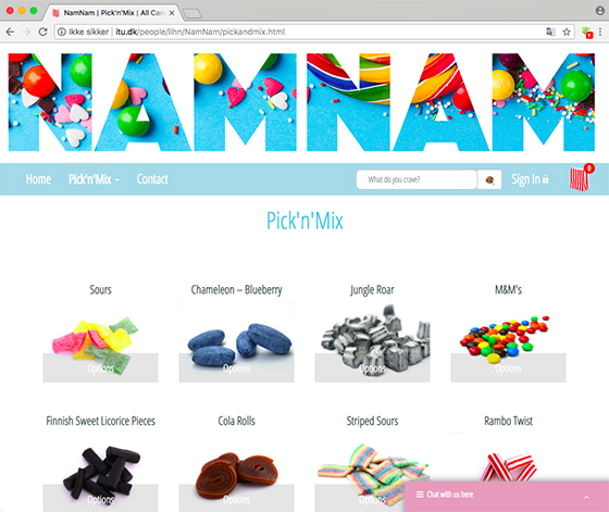
The most of us know the feeling of entering a candy store and getting the opportunity to pick and mix from all the different variants. It is an overwhelming experience with all the different smells, colors and figures. But to be honest, most of us have been in situations where we do not want to leave our couch or bed on a Friday night to visit the candy store. Inspired by services as just-eat.dk and nemlig.com, we developed a concept that offers the opportunity to buy pick-and-mix candy online. It functioned as the foundation of this project and the website we designed.
By collaborating with NamNam, a chain of five pick-and-mix candy stores located in Greater Copenhagen, and interviewing their costumers, we got the chance to explore how it is possible to design a user-friendly and visually tempting website that offers the opportunity to buy pick-and-mix candy online and gives the customer the same various picking choices as in the physical candy store. Thereby we also chose that our website should be a redesign of NamNam (namnamslik.dk) which has not been updated since 2014, has a lot of errors and most importantly does not offer the opportunity to buy pick-and-mix candy online.
The journey of creating a complete and responsive website based on real needs/opportunities includes everything from research and strategy to coding and user testing. Thereby the aim of the course and project has also been to learn and understand the whole design process of going from a concept to a functional website.
Methods, approaches and techniques used: User-centered approach, User research (quantitative survey, qualitative interviews), Brainstorming, Information architecture, conceptual models, style-tiles, mood boards, wireframing, sketching, usability tests, Coding (HTML5, CSS, JavaScript & jQuery), UX, Mobile First, Bootstrap (Responsive Webdesign).
Pokémon Go
Four strategic design suggestions for an optimisation of the gameplay by L. Hesselholdt
Course: Digital Interactive Media - Bachelor project
Research Question: What potential is to be found in Pokémon Go as a digital interactive media and how is it possible to optimise the gameplay in order to increase the user experience and avoid ethical callenges?
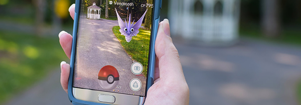
We live in a time where technology and digital interactive media are constantly developing and playing a bigger role in our every day lives. This brings new opportunities; hereunder the possibility to mix reality and fiction via augmented reality (AR). The mobile game based on AR technology, Pokémon Go, has been a big succes, but it has not only resulted in positive experiences.
This bachelor project examined the opportunities and challenges that digital interactive media, and its new technologies, may contain. More specific, it concerns the worldwide free to play augmented reality game, Pokémon GO, which was dominant in the summer of 2016 and has resulted in both positive and negative user experiences. The knowledge established throughout the project period, including design elements of the game, its potential, and the user experience itself, resulted in four strategic design ideas with the aim of optimising the game. The design ideas should improve the user experience and ensure that the design takes ethical challenges into account: Hereby situations where users are absorbed by the game to such an extent that they are no longer able to follow their common sense. Examples of this includes users who play while driving, and thereby put others and themselves in danger, as well as users who play on private ground, and therefore do not respect the privacy of others.
The two first ideas attempt to decrease the ethical challenges by reducing the users’ opportunities of interaction in the game, while the last two ideas attempt to improve the user experience by not only making information easily accessible in the interface, but also by creating consistency between the different functions that are present.
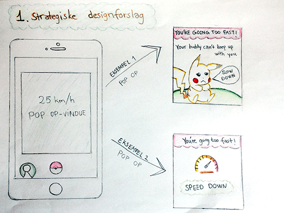
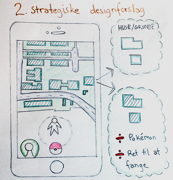
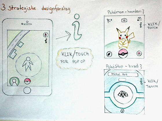
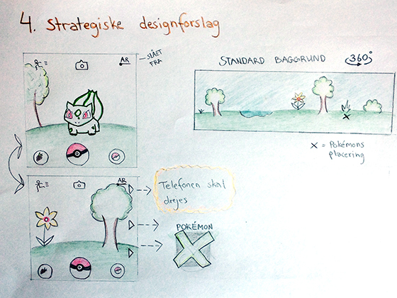
Sketches of the suggested design ideas are shown below.
Methods, approaches and techniques used: User-centered, hermeneutic, and phenomenological approach, Etnographic methods (qualitative interviews and observations), Persuasive Design, Principles of good interaction design, Design principles, Sketching.
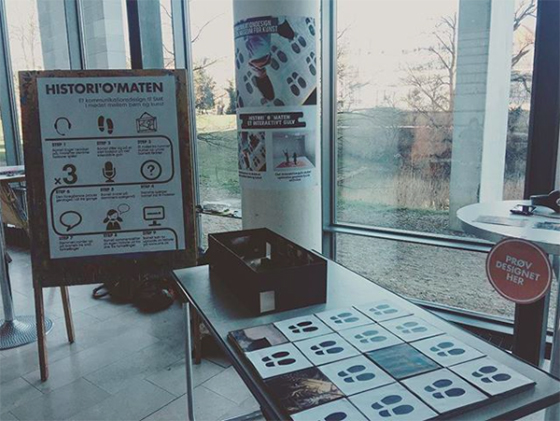
Histori'o'maten
An interactive communication design by L. Hesselholdt, C. Bondesen, F. Fréder, M. Madsen & S. Carstensen
Course: Communication Design - Experience, time and place
Task: Help Statens Museum for kunst (SMK) to ensure that meaningful experiences occur when children meet art.
The classic museum is characterized by paintings on the wall and descriptions besides these. As a museum guest, you walk silently from one painting to another. But in line with the development of new technologies, people often want to experience the art or even be a part of it. They get intrigued by the possibilities of participating and interacting, and children especially get motivated by play and physical activities.
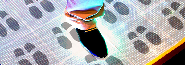
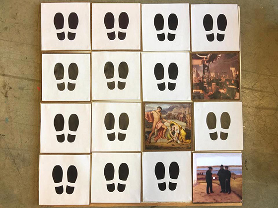
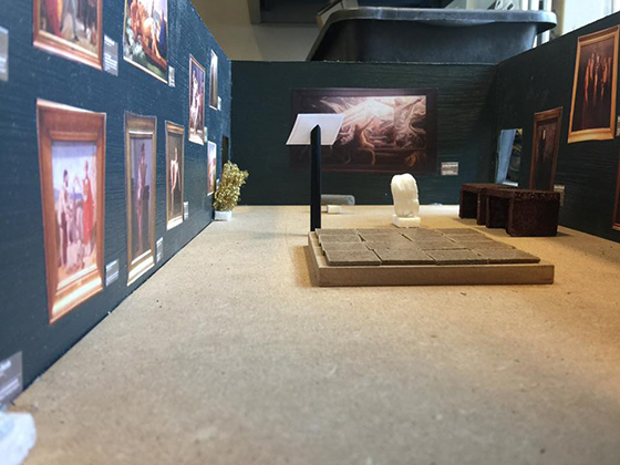
Histori'o'maten is a communication design that aims to create meaningful experiences for children when they visit SMK. This by allowing them to be physical active, play and create their own stories involving the art on the walls. Interactive squares with footprints are projected on the floor. When walking on one of these, a painting from the room is shown under the child's feet. If wearing the headset connected to the activity, a voice will now ask a question in order to make the child reflect and create its own story based on this specific painting. The question could be everything from "what do you feel when you look at the painting?" to "what do you think they are doing on the painting?". The child can choose to continue the story by stepping on another footprint whereby a new painting will be shown and a new question will be raised.
Pictures of the final prototype are shown below.
Methods, approaches and techniques used: User-centered and Pragmatic approach, Design-based research, Qualitative methods (interviews and observations), Design principles, Brainstorming, Sketching, Prototyping (wood, paper, painting).
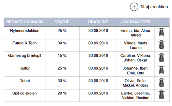
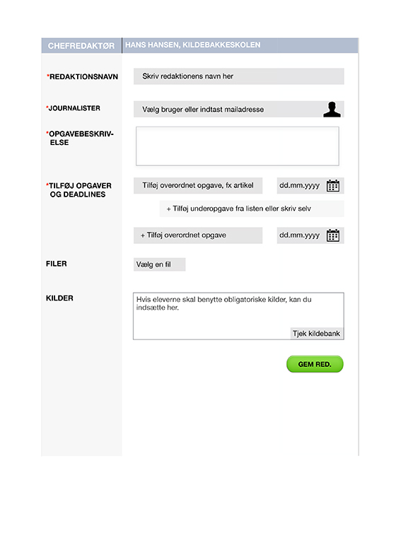
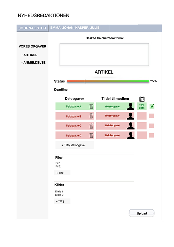
The editors
A digital process tool for spiljournalist.dk by L. Hesselholdt, S. Johansen, C. Andreasen, & M. Bruus-Jensen
Course: Communication Design - Learning, network and organisation
Task: Create a design for spiljournalist.dk that supports learning, network and organisation.
Gaming has become more and more popular among children. Therefore, it can be motivating for students if game elements are impelemented in the education programme. The idea behind spiljournalist.dk is to create an educational tool that teaches the students to write journalistically about games and gaming. When getting the opportunity to write about games, it should make the students more intrigued and open to learning.
The editors is a digital tool for spiljournalist.dk that aims to include all group members of a specific student project (concerning a specific game), provide the opportunity for progression, and create an overview of the whole writing process. This by letting each student choose a sub-task from the overall given by the teacher (the chief editor), set a deadline for the subtask, and check it off when done. The status of completion (of the overall task) is visible at the top of the screen by a coloured status bar so that the students will always be aware of the amount of work they have left. In the long term, the tool should be able to make the students organise their work process by themselves.
Pictures of the digital tool are shown below.
Methods, approaches and techniques used: User-centered and Pragmatic approach, Design-based research, Naming & framing, Didactics, Qualitative methods (interviews and observations), Design principles, User testing, Sketching.
Teacher view:
Student view:
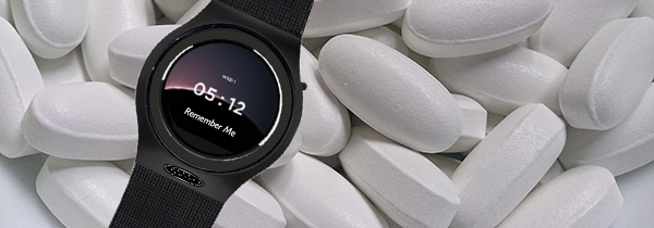
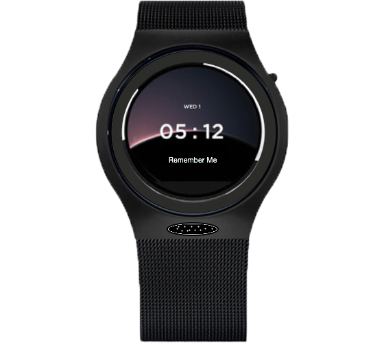
Remember Me
A digital medicine reminder by L. Hesselholdt, C. Andersen, S. Lückow, & A. Joa
Course: Design and ICT in an organisational context
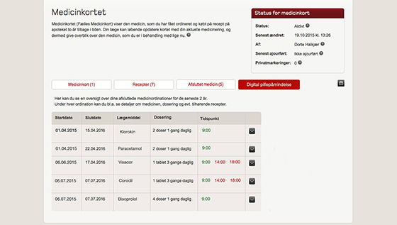
Task: Identify opportunities and problematic areas within the big IT system FMK (Det Fælles Medicinkort) in order to design a technology that might solve one or several of these.
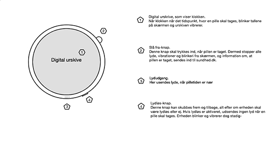
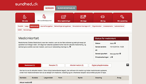
FMK is developed with the aim of reducing medication errors by facilitating the co-operation between people in the health sector and giving the individual citizen access to its own personal health data via sundhed.dk. But how do we ensure that the medicine is taken at the correct time when FMK does not provide information about this? We introduce Remember Me - a digital medicine reminder that helps the patient to take his/her medicine correctly and makes he/she capable of managing her/his own affairs.
Remember Me is designed as a digital watch with simple features. It is connected to sundhed.dk where a new function makes it possible for every doctor to insert data about patients' optimal medication time. The data is sent to the watch which lightens up, vibrates and bleeps when time is right. When the medicine has been taken, the patient press a little button. Information about this reaction is now sent back to sundhed.dk (and is visible for the doctor), and the watch immediately stops making sounds and vibrating movements.
Pictures of the watch and the added function on sundhed.dk are shown below.
Methods, approaches and techniques used: User-centered and interaction-driven approach, Desk research, Problem Setting, Qualitative method (interviews), UX, Brainstorming, Sketching, Wireframing.